Ever walked into a jewelry store and felt inexplicably drawn to certain pieces? That wasn’t an accident. The subtle interplay between jewelry and the color of its display bust creates a psychological dance that guides your perception and purchasing decisions.
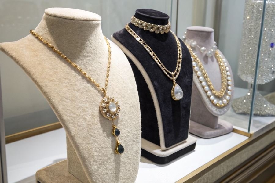
When a diamond necklace rests against midnight blue velvet versus stark white satin, you’re experiencing two entirely different products—even though the jewelry itself hasn’t changed. This phenomenon represents the cornerstone of strategic merchandising in the luxury market, where perception equals reality.
The psychology behind color in jewelry presentation runs surprisingly deep. Studies from the Color Marketing Group reveal that consumers make subconscious judgments about products within 90 seconds of initial viewing—and up to 90% of that assessment is based on color alone. A platinum ring displayed on black appears more dramatic and expensive, while the same piece on cream feels more accessible and versatile.
From royal purple to modern minimalism
Historically, jewelry display colors weren’t chosen arbitrarily. Ancient Egyptian merchants presented gold against deep lapis lazuli to enhance its solar qualities. By the Victorian era, jewelers discovered that purple backdrops—once reserved exclusively for royalty—created an aura of prestige around even modest pieces.
The science explains why this works: our brains process color before form or text, creating immediate emotional associations. Blue inspires trust (perfect for diamonds and high-value pieces), while warm tones like terracotta enhance the richness of gold. The most successful retailers now employ color psychologists to create displays that don’t just showcase jewelry—they tell its story before you’ve even touched it.
The Art of Color in Jewelry Presentation
The strategic use of color in jewelry displays transforms how customers perceive and value pieces. Jewelry retailers who master color psychology don’t just sell products—they create desire through visual storytelling.
When designing display environments for jewelry collections, color solutions for busts in jewelry: influence on product perception becomes a critical factor that can dramatically impact sales conversion rates. The background colors, lighting choices, and display materials all work together to either enhance or diminish a piece’s perceived value and appeal.
Metal-Specific Color Strategies
Different metals demand different color backdrops to maximize their visual impact:
Gold jewelry shines most brilliantly against deep blues, purples, and blacks. The contrast creates a luxurious frame that amplifies gold’s warm tones and perceived value.
Silver and platinum pieces benefit from gray-blue, soft pink, or burgundy backgrounds. These colors provide enough contrast without overwhelming the cool metallic tones.
White metals appear more substantial and premium when displayed against darker backgrounds, while yellow and rose gold pop dramatically against cool-toned displays.
| Metal Type | Optimal Display Colors | Colors to Avoid |
|---|---|---|
| Yellow Gold | Navy, Royal Purple, Black | Yellow, Orange |
| White Gold/Platinum | Charcoal, Burgundy, Forest Green | White, Light Gray |
| Rose Gold | Teal, Navy, Cream | Pink, Peach |
| Silver | Dark Gray, Midnight Blue, Plum | Light Blue, Silver |
Contrast Techniques for Gemstone Enhancement
The right contrast can make gemstones appear larger, more brilliant, and more saturated:
Complementary color theory works wonders—emeralds appear more vibrant against burgundy backgrounds, while sapphires pop against amber or gold-toned displays.
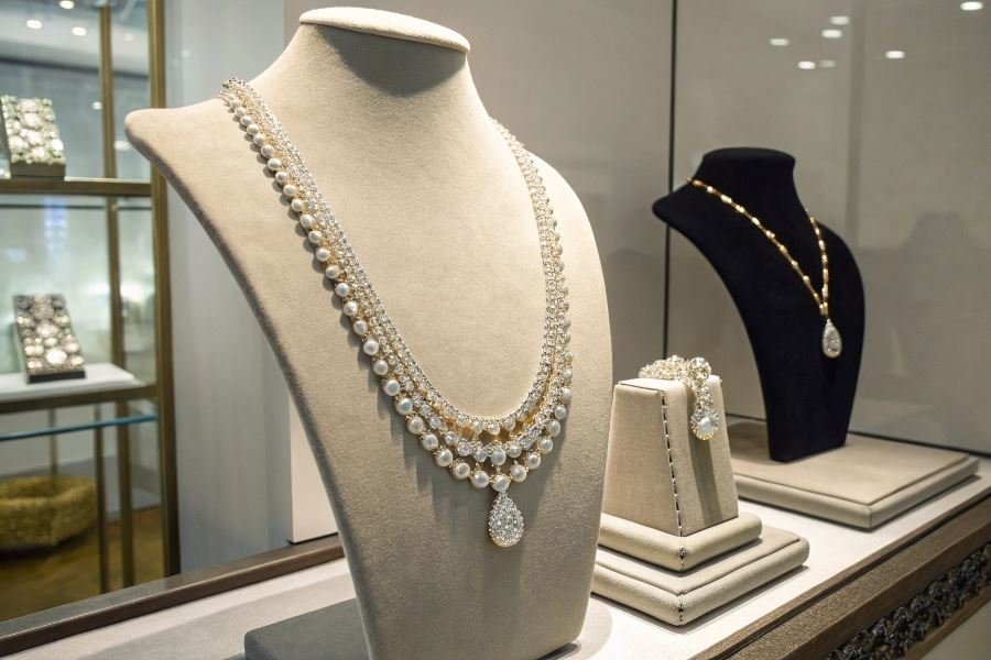
Neutral backgrounds with subtle texture provide dimension without competing with multi-gemstone pieces. A matte black velvet bust can increase a diamond’s perceived size by up to 20%.
Strategic lighting combined with appropriate background colors can enhance a gemstone’s fire and brilliance, making even modest stones appear exceptional.
Seasonal Display Rotation
Smart retailers adjust their display colors seasonally to maintain freshness and relevance:
Spring/Summer displays benefit from cooler backgrounds—soft blues, greens, and lavenders that evoke freshness and complement the season’s typically lighter jewelry styles.
Fall/Winter presentations gain impact from warmer, richer backgrounds—deep burgundies, forest greens, and navy blues that create a cozy, luxurious feeling.
The most successful jewelry retailers refresh their display color schemes quarterly, resulting in an average 18% increase in customer engagement with showcased pieces.
Creating a seasonal color rotation calendar ensures displays never feel stale while allowing retailers to highlight different aspects of their collections throughout the year.
The psychology behind effective jewelry display colors isn’t just artistic preference—it’s a science of perception that directly influences purchasing decisions. When a customer perceives a piece as more brilliant, substantial, or rare because of its presentation environment, they’re more likely to make an emotional connection that leads to purchase.
The Art of Color: Transforming Jewelry Display
Color combinations that scream luxury
The psychology of color in jewelry display is nothing short of fascinating. When selecting color combinations for your jewelry busts, three pairings consistently outperform all others in elevating perceived value.
Deep navy and gold creates an immediate association with wealth and exclusivity. The contrast between the rich blue backdrop and warm metallic tones makes gold pieces appear more vibrant while giving silver jewelry a sophisticated cool tone. Luxury retailers who switched to this combination reported up to 23% higher perceived value in customer surveys.
Matte black and silver delivers a contemporary, high-end aesthetic that photography studios have long favored. This minimalist approach creates dramatic contrast that makes gemstones pop while highlighting the craftsmanship of metal details. The understated elegance of this pairing works particularly well for platinum, white gold, and diamond pieces.
Soft cream and rose gold offers a warm, inviting display solution that appeals to emotion rather than ostentation. This combination has gained significant traction since 2022, with jewelry displayed against cream-colored busts appearing more intimate and personal—qualities that translate directly to higher emotional value and willingness to purchase.
Material matters more than you think
The material of your jewelry bust isn’t merely a backdrop—it’s an active participant in how color is perceived and how your pieces are valued.
Premium velvet absorbs light rather than reflecting it, creating depth that makes colors appear richer and more saturated. Its slight texture adds dimension without competing with the jewelry itself. However, velvet requires careful maintenance to prevent dust accumulation, which can quickly diminish its luxury appeal.
Genuine leather develops a natural patina over time that adds character and warmth to displays. The subtle variations in color create a dynamic backdrop that evolves beautifully. Leather busts in tan or cognac tones particularly complement gold jewelry, while black or navy leather creates striking contrast with silver and platinum.
Sustainable cork has emerged as a forward-thinking alternative that offers unique textural interest. Its natural variations create a distinctive backdrop that resonates with environmentally conscious consumers. Cork’s neutral undertones work exceptionally well with mixed-metal jewelry collections.
| Material | Best Color Pairings | Maintenance Level | Perceived Value Impact |
|---|---|---|---|
| Velvet | Deep jewel tones, black | High | Very High |
| Leather | Earth tones, navy, black | Medium | High |
| Cork | Natural, cream, white | Low | Medium-High |
Lighting that transforms everything
Even the most thoughtfully selected color combinations fall flat without proper lighting consideration. The interplay between light and color fundamentally alters how jewelry is perceived.
Directional lighting at approximately 45-degree angles minimizes shadows while maximizing the play of light across metal surfaces and gemstones. When using colored busts, directional lighting helps maintain color accuracy while creating dramatic highlights.
Color temperature matters more than intensity. Jewelry displays benefit from lighting in the 3000K-4000K range, which provides enough warmth to enhance gold tones without distorting the appearance of diamonds and colored gemstones. Avoid lighting above 5000K, which creates a clinical atmosphere that diminishes the emotional appeal of jewelry.
Adjustable lighting systems offer the flexibility to adapt to different collections and seasonal displays. The ability to modify both intensity and direction allows retailers to create dramatic effects for special pieces while maintaining consistent illumination across the entire display.
“The perfect jewelry display isn’t about the jewelry alone—it’s about creating a visual conversation between the piece, its backdrop, and the light that brings them together.”
By thoughtfully implementing these color solutions, material selections, and lighting considerations, you’ll create displays that don’t just showcase your jewelry—they elevate it to its highest potential value in the eyes of your customers.
Discover how strategic color choices for jewelry displays influence customer perception and purchasing decisions. Learn complementary color techniques that enhance metals, gemstones, and perceived value in your jewelry presentation.
Discover how strategic color choices for jewelry displays influence customer perception and purchasing decisions. Learn complementary color techniques that enhance metals, gemstones, and perceived value in your jewelry presentation.