Ever walked into a massage room and felt instantly calmer without knowing why? That subtle shift might be happening because of something you barely noticed—the color of the massage table cover beneath you.
Color isn’t just decorative; it’s a powerful psychological tool that directly influences how clients experience your services. The right massage table cover can transform an ordinary treatment into an extraordinary sensory journey. When selecting covers for your establishment, you’re not just making a practical choice—you’re crafting the emotional foundation of your client’s experience.
Studies from the Color Research Institute show that blue tones can lower blood pressure and heart rate by up to 11%, while warm tones like terracotta can stimulate conversation and energy. This isn’t just aesthetic theory—it’s measurable physiology. The color beneath your clients becomes part of their therapeutic journey, either enhancing or potentially undermining your skilled touch.
Beyond the immediate client experience, table covers serve as visual anchors in your space. They’re the canvas upon which your treatments unfold. The most successful salons understand that these seemingly minor details create the cohesive atmosphere that clients remember and return for.
When selecting your color palette, consider:
- Your brand identity and the emotions you want to evoke
- The natural lighting conditions in your treatment rooms
- Cultural associations with specific colors among your clientele
- Practical concerns like stain visibility and cleaning requirements
Remember that darker colors like navy or forest green create depth and grounding, while lighter shades expand spaces visually. The perfect color solution isn’t just beautiful—it’s strategic.
Strategic Color Choices for Massage Table Covers
The massage table cover might seem like a minor detail in your salon setup, but it’s actually a powerful design element that affects client perception, therapeutic outcomes, and brand identity. Selecting the right color for your massage table covers requires strategic thinking that balances aesthetics, functionality, and psychological impact.
When considering color solutions for massage table covers in salon interiors, professionals must weigh multiple factors: durability, client comfort, cleaning requirements, and how these colors interact with existing design elements. The right choice creates harmony; the wrong one can disrupt the carefully crafted atmosphere you’ve built.
Let’s explore the three most effective color strategies that successful salon owners implement:
Neutral and Earth Tones for Timeless Appeal
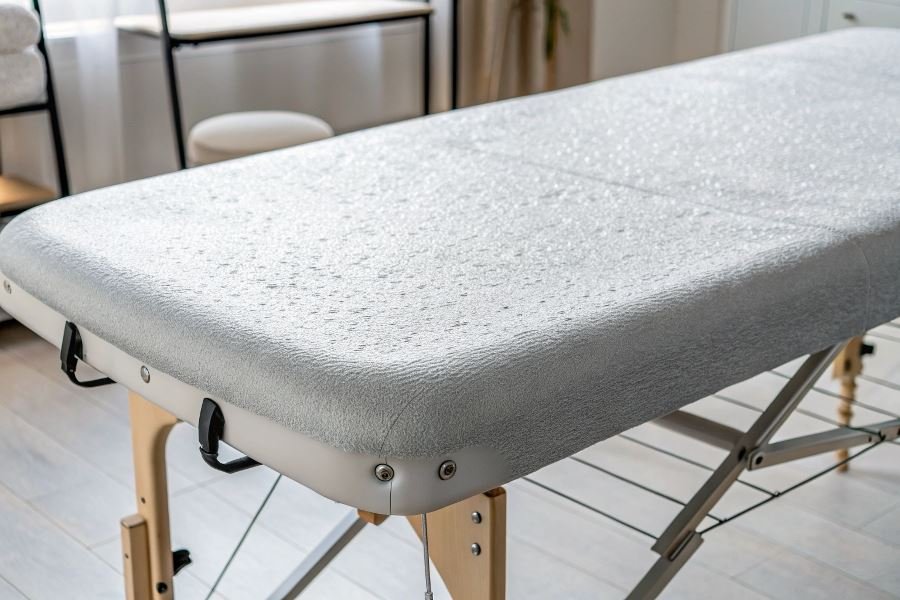
Neutral colors remain the gold standard for massage table covers for good reason. These versatile options—including cream, beige, taupe, and soft gray—create a foundation that:
- Complements virtually any interior design without competing with other elements
- Provides visual longevity as design trends come and go
- Creates a perception of cleanliness and professionalism
Earth tones like sage, terracotta, and warm browns offer similar versatility while adding subtle warmth. These colors connect clients to natural elements, enhancing the grounding experience of massage therapy.
| Color | Psychological Effect | Best Paired With |
|---|---|---|
| Cream | Calming, clean | Wood accents, plants |
| Taupe | Sophisticated, neutral | Metal fixtures, stone |
| Sage | Grounding, natural | Natural textiles, warm lighting |
Blues and Greens for Therapeutic Environments
The science behind blue and green hues in therapeutic settings is compelling. These colors:
- Lower blood pressure and heart rate according to multiple studies
- Reduce anxiety and stress hormones during treatment
- Create an immediate sense of tranquility upon entering the space
Specific shades like seafoam green, powder blue, and teal have proven particularly effective in massage environments. The key is selecting muted, soft versions rather than vibrant tones that might stimulate rather than calm.
“The right shade of blue or green on a massage table can reduce perceived treatment time by up to 15% while increasing reported satisfaction with results.”
These colors work exceptionally well in therapeutic-focused practices like rehabilitation centers, sports massage clinics, and wellness spas where stress reduction is a primary goal.
Brand-Aligned Colors That Enhance Identity
Your massage table covers represent a significant canvas for brand expression. Forward-thinking salon owners use this opportunity to:
- Reinforce brand recognition through consistent color application
- Differentiate their practice from competitors in memorable ways
- Create Instagram-worthy moments that clients naturally want to share
This doesn’t mean choosing bright purple covers simply because it’s your logo color. Instead, consider how your brand colors can be adapted to maintain the therapeutic environment while still being recognizable.
For example, if your brand features deep burgundy, consider a muted mauve for table covers that references your brand without overwhelming the space. If teal is your signature, a soft seafoam might be the perfect translation for treatment surfaces.
The most successful implementations balance brand expression with client comfort, never sacrificing the latter for the former. When done correctly, clients begin to associate your specific color palette with the positive feelings they experience during and after treatments.
Mastering Color in Practice: Implementing Massage Table Cover Solutions
Strategic Seasonal Rotations
Smart salon owners understand that rotating massage table covers seasonally creates a refreshed atmosphere without major renovations. Winter calls for deep burgundies, forest greens, and navy blues that evoke warmth and comfort during colder months. As spring arrives, transitioning to sage greens, soft lavenders, and gentle blues can mirror the seasonal renewal outside your windows.
Summer presents the perfect opportunity to introduce vibrant turquoise, coral, or sunshine yellow covers that energize clients. When autumn approaches, amber, terracotta, and muted gold covers create a harmonious connection with the changing landscape. This quarterly rotation strategy keeps your space feeling current while extending the lifespan of your entire cover collection.
Insider tip: Create a color calendar for your salon that plans cover rotations 12 months ahead, coordinating with both seasons and any promotional themes your business runs throughout the year.
Material Matters: Textures That Enhance Color
The material of your massage table covers dramatically influences how colors are perceived and experienced. Premium microfiber blends offer vibrant color saturation while providing exceptional softness against skin. Cotton-polyester blends balance breathability with color retention, particularly important for medium-to-dark tones that might otherwise fade quickly.
For luxury salons, bamboo-derived fabrics present an eco-conscious option that holds subtle, sophisticated colors exceptionally well while offering natural antimicrobial properties. The slight sheen of bamboo fabrics makes even understated colors like taupe or slate appear rich and dimensional.
Consider texture variations that complement your color choices:
| Texture Type | Best Color Pairings | Client Experience |
|---|---|---|
| Brushed Microfiber | Deep jewel tones, pastels | Velvety, cocooning sensation |
| Waffle Weave | Neutrals, earth tones | Subtle tactile stimulation |
| Sateen Finish | Metallics, rich darks | Luxurious, smooth glide |
| Natural Linen Blend | Undyed naturals, soft blues | Organic, grounding texture |
The interplay between texture and color creates a multisensory experience that elevates client satisfaction beyond what either element could achieve independently.
Longevity Strategies for Colored Covers
Investing in quality colored covers requires thoughtful maintenance protocols to protect your investment. Dark colors like chocolate brown or midnight blue show less visible staining but can transfer dye if not properly color-set during manufacturing. Premium covers from Earthlite or Living Earth Crafts typically undergo rigorous colorfastness testing.
For maximum longevity:
- Wash colored covers in cold water with professional-grade detergents specifically formulated for spa linens
- Implement a rotation system that gives heavily-used covers adequate rest periods
- Store covers away from direct sunlight which can cause even premium dyes to fade unevenly
- Consider color-specific treatments – blues and greens benefit from occasional vinegar rinses to maintain vibrancy
The most durable color options typically include medium-tone neutrals like sage, taupe, and slate blue, which balance stain-resistance with minimal fading. These workhorse colors can anchor your seasonal rotation strategy, appearing throughout the year while more trend-focused colors make seasonal appearances.
By implementing these practical strategies for color management, your massage table covers become not just functional elements but dynamic components of your salon’s sensory brand experience, working harmoniously with your interior design while standing up to the demands of daily use.
Discover how strategic color choices for massage table covers can transform your spa's atmosphere, enhance client relaxation, and strengthen your brand identity. Learn practical color psychology for salon interiors.
Discover how strategic color choices for massage table covers can transform your spa's atmosphere, enhance client relaxation, and strengthen your brand identity. Learn practical color psychology for salon interiors.